In Balthzar Clients left side menu there is an option called "Live data". In order to start this you have to first select the machine you wan't in the overview menu then press the icon for "Live data" in the left side menu.
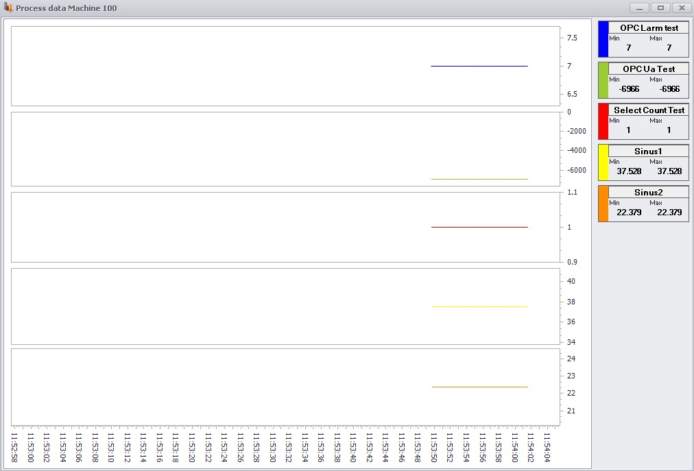
In our exmpale we are using a machine with machine ID 100. You can see the machine and it's selected OPC values below.
In the picture above the opc values are represented by the different colors. In the top right corner you can see which color belongs to which OPC value as well as their max and min values. You can set data for OPC values in Client -> Tools -> Options -> Process Values -> Process Value . If you right click in the graph you can gain acess to a settings menu where you can further customize you're data.
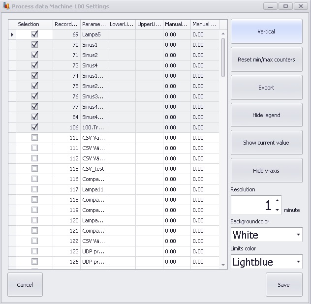
In this settings menu you can see a list with the available OPC values for this specific machine. In order to show them in the graph you have to tick the "Selection" box as seen in the picture above. In here you can also manually set the OPC values min/max limits. If you do this it is important to know that they will overried the limits set in the proces values settings in the admin part of the Client. If you should use the same values here as in the proces values settings menu it is important to know that it is the values from the proces value settings menu that will be activated here. Below you can find an explanation for what the different buttons does.
Vertical/Horizontal
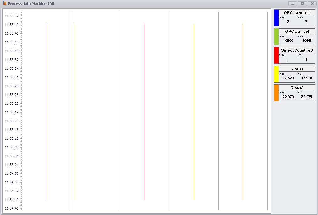
Here you can change if you wan't to display the lines in a
different direction compared to horizontal.
Reset min/max
counters
Here you can reset the data shown in the picture.
Export
Here
you can choose to export the live data graph to a pdf file.
Hide
Legend
Here you choose if you wan't to hide or show the top
right images which displays names, data and color info for each graph.
Show current value/Show min/max
This
button will let you choose between weather you wan't to display information
about current value or the min/max value in images in the top right
corner.
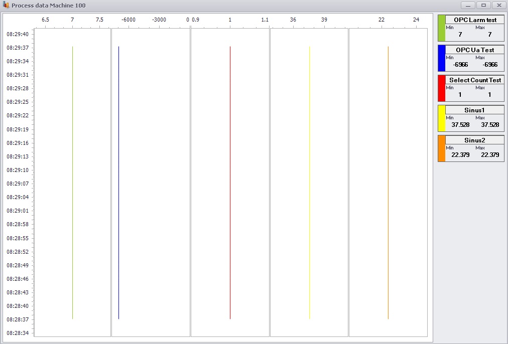
Hide y-axis/Show y-axis
This button will
let you choose between weather you wan't to hide or show the y-axis in the
graph.
Resolution
Here you can choose the
time span for the current graph, will be shown in minutes.
Background color
Here you choose what
background color the graph should have.
Limits color
Here you choose what color
the limits in the graph should have.
In order to save you're changes you click the button "Save" and if you wan't to return to process data window you simply click "Cancel". Below are some pictures showing what it looks like if you display a horizontal graph and choose to hide the y-axis.