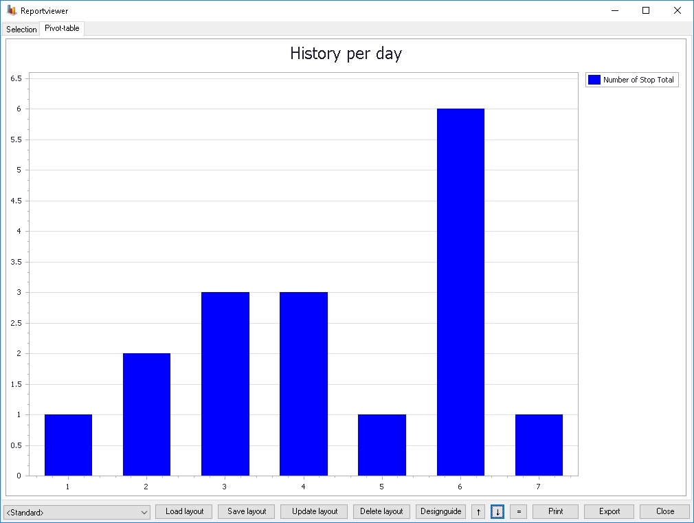
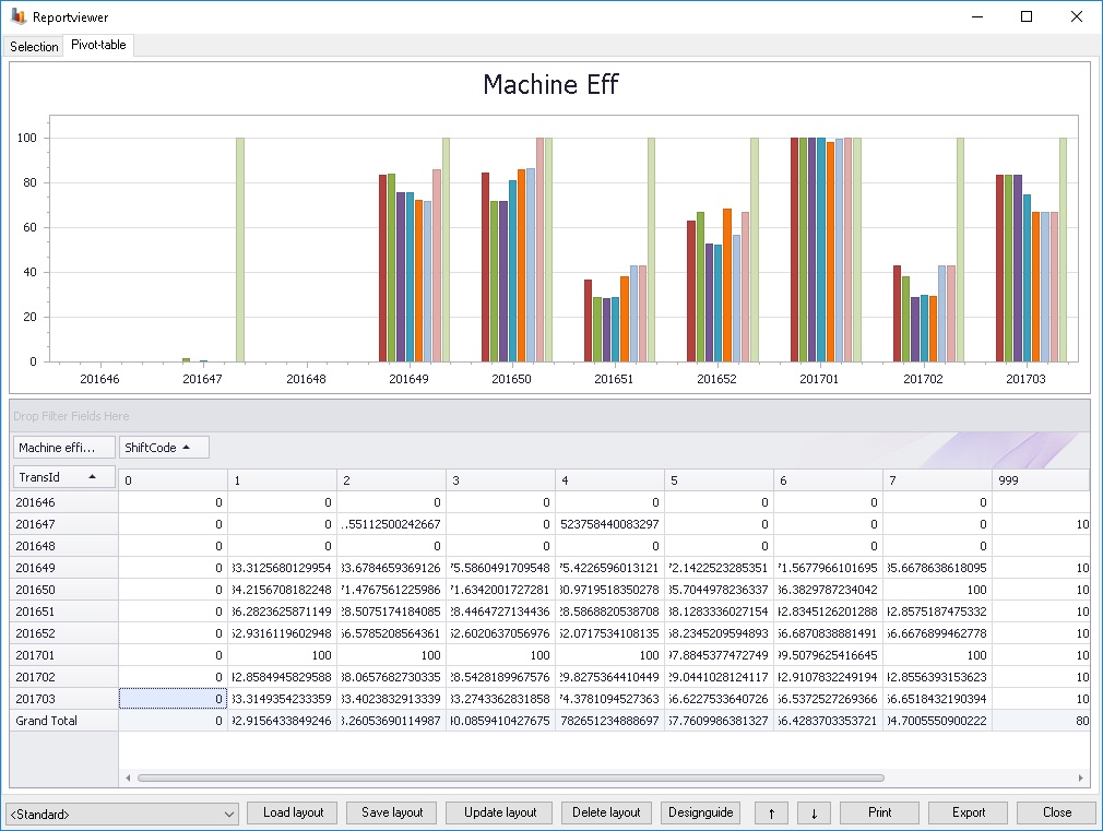
Reports that are generated and that shows grapsh are opend in the reportviewer. One example of how a report might look can be seen in the image below.
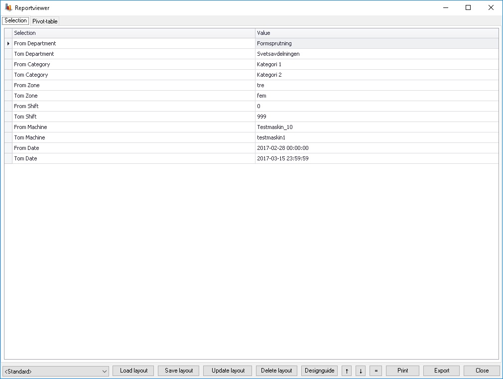
If the reportviewer is opened from a report there are two different tabs to choose from, selection and Pivot table. If Pivot table is selected it is shown like in the image above with a graph. If selection is shown a window is opened that shows what selections the graph is using, see image below. If it is opened elsewhere there is only one tab, the pivot table.
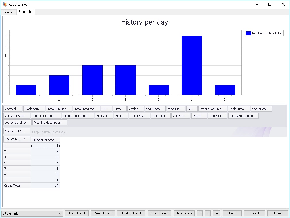
There are two arrow buttons in the bottom of the screen, one up and one down. The up arrow button shows the pivot table and the down arrow button hides the pivot table. In the upcoming section we will take a closer look at the graph/pivot, see picture below.
Below is a minor field example.
Below the graph there are blocks that decides how the graph should look depending on where they are arranged. By moving the blocks around the graph looks differently.
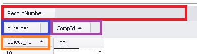
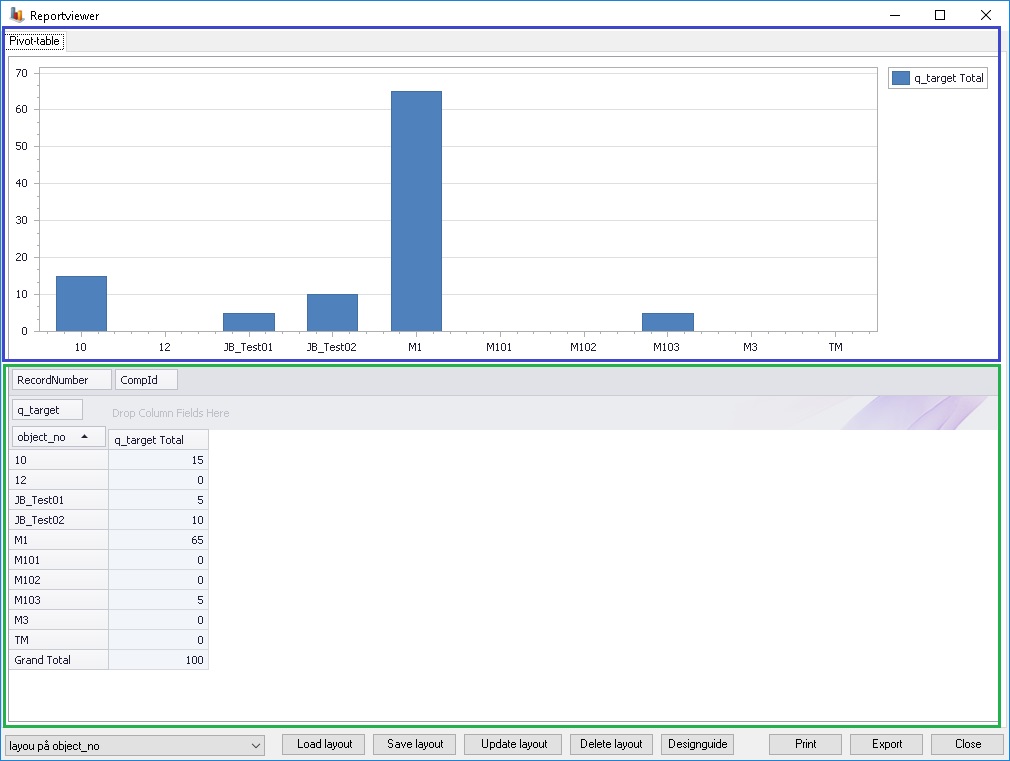
Blocks that are placed in the
red box (RecordNumber in the image above) will not be included in the
graph.
Blocks that are placed in the blue
box (q_targetin the image above) are shown as cells in the list and as
bars in the graph, (it's the "values").
Blocks
that are placed in the orange box (object_no in the image above) are shown as
rows in the list and as the x-axis in the graph.
Blocks that are placed in
the purple box (CompId in the image above) are shown as columns in the list and
decides the coloring of the bars.
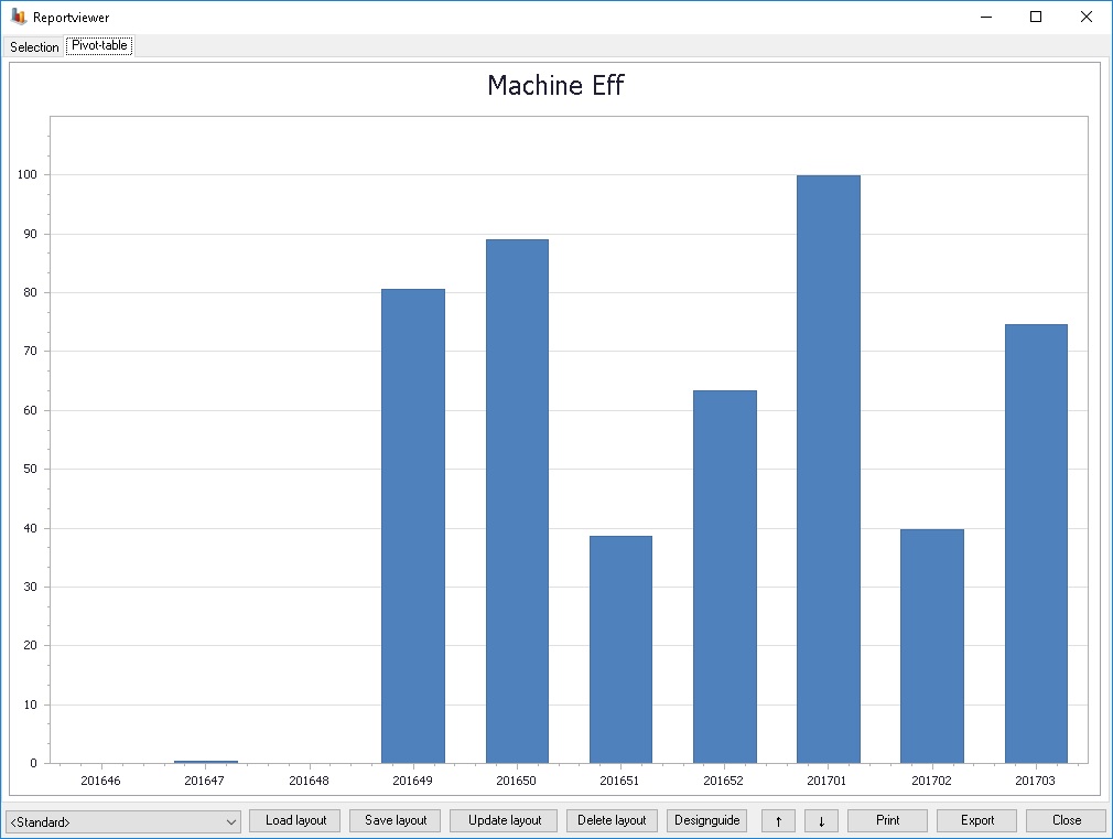
After re-arranging the boxes the graph could for example look as below.
At the bottom of the reportviewer there are buttons. See the image below.

An explanation of the buttons can be found below:
Drop down
list
The standard list is a list with all available layouts. You can
choose a layout in the list and then click on either of the buttons called "Load
layout", "Save layout", "Update layout" and "Delete layout".
Load
layout
This button will let you load whatever loadout you have
choosen.
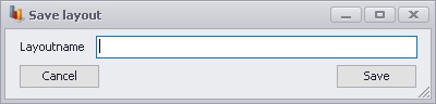
Save
layout
This button will let the user save the current layout. When
you do this a new window will appear which will let the user enter a name for
the newly saved layout. See picture below.
Update
layout
Will replace the previous layout with the currently selected
layout.
Delete layout
Will remove the selected layout from the list of available
layouts.
Designguide
This will open up a new window
which will give the user access to the Designguide. Here you will be able
to design the graph after you're preferences.
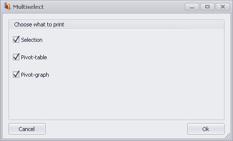
Print
This will open up a new window
where the user gain acess to a number of options which will determine what will
be printed. Each choice will be printed on one or more pages depending on it's
content.
Up and down arrows
Theese arrows are used to either show (the up arrow) or hide (the
down arrow) the pivot grid.
Equal
to
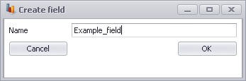
This button allows the user to create their own fields.
When you click the button a new window will appear where you will enter a
name of the field. See picture below.
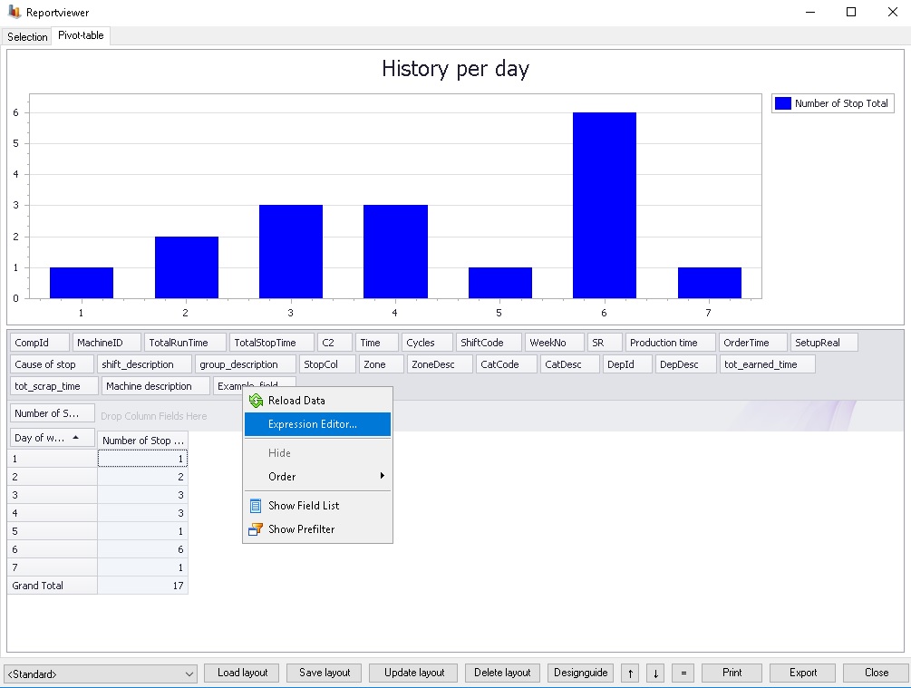
Once the user has created the field and named it it is important to know that the field will not contain any data. In order to solve this you can right click on the specific field and choose "Expression editor". See picture below.
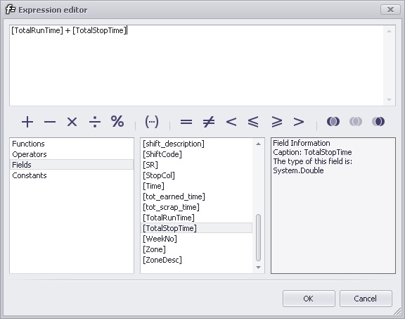
This will in turn open up another window called the "Expression editor". In here you can make the calculateions needed to determine what to show. In the example below we add the two fields "TotalRunTime" and "TotalStopTime" and put the result into the new field.
Selection gives a list like in the image on the right side at the top of this page. Pivot table creates a table with data, see the green box in the image below. Pivot graph gives the graph shown in the blue box below.
Export
Export let's the user choose a map on the computer where he/she
wan'ts the graph exported. When this is done three files will be created. One
with the selection, one with the pivot table and one with the graph.